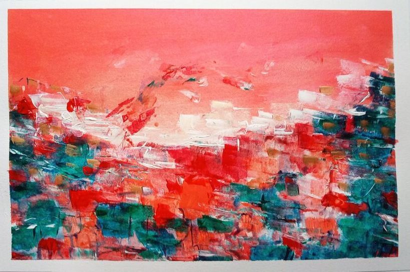
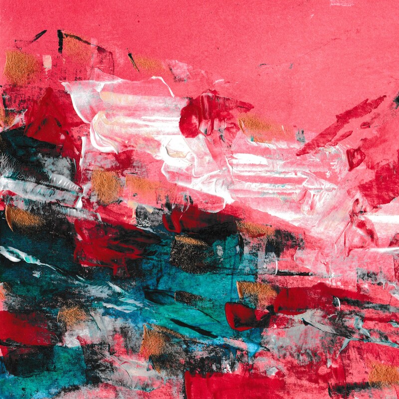
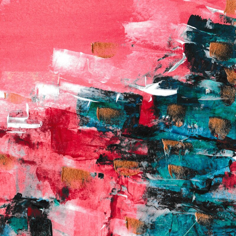
 I want to make two points, using this painting to do so: 1) Movement. Notice the curve blowing over at the top and the peachy-white spaces smudging against each other and floating on the tips of the waves. Working with fluid acrylics creates space for this movement. And movement reminds me that things change. That negative spaces can become positive and good times should be counted as blessings rather than a guarantee. 2) Colour. I love these colours. You might also love them, or you might not, but zoom in (click on the images below) and you can see bright red that becomes deep red as it nears a particular edge; coral overlaid with dark teal lines; teal that runs through green to blue, to purple, to almost black; and flecks of gold that shine. Like, really shine. There are colours and interactions between colours that you only see when you look close, and which I, as the artist, didn't always plan for. It reminds me of the possibility of more. Points me to a God who "is able to do far more abundantly than all that we ask or imagine, according to the power at work within us" - if I'm willing to stop, look and notice them. Shows me that sometimes things appear when and where they're not expected. Even during annoying, anger-provoking or sad times, unexpected good ideas or occurrences can appear! As if from somewhere beyond you - and this, at least for me, is a comfort I need to be able to rely on!
0 Comments
|
Like the Facebook page to keep up-to-date with blog posts!
Author
I'm a recent Cambridge Theology graduate now studying for a Masters in Biblical Studies and blogging about all sorts of things! I'm interested in faith, Church, theology, social action, the great outdoors and being creative, and all of those things - along with many more - come through in my posts!
Categories
All
Archives
April 2020
|

 RSS Feed
